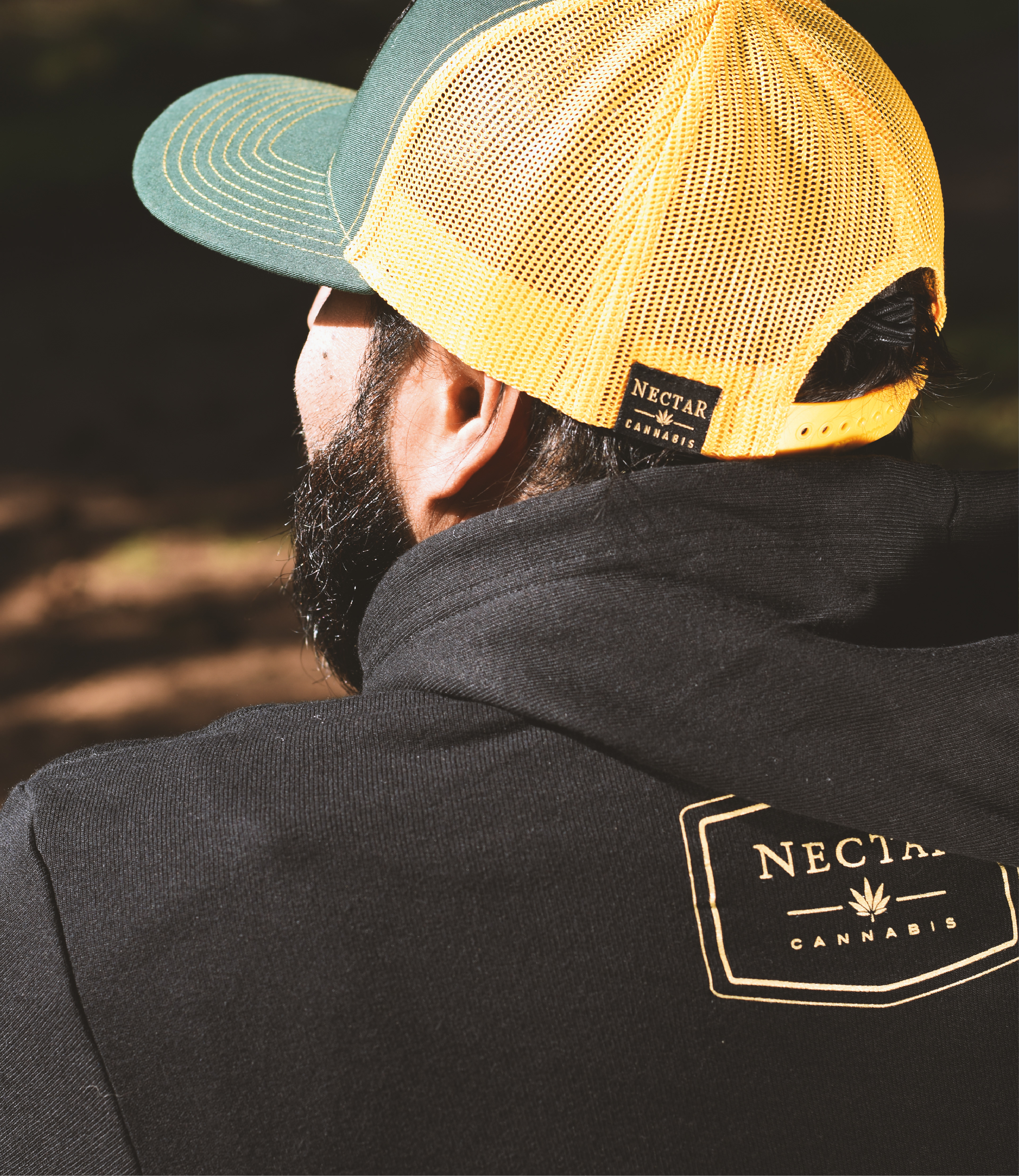

Badge
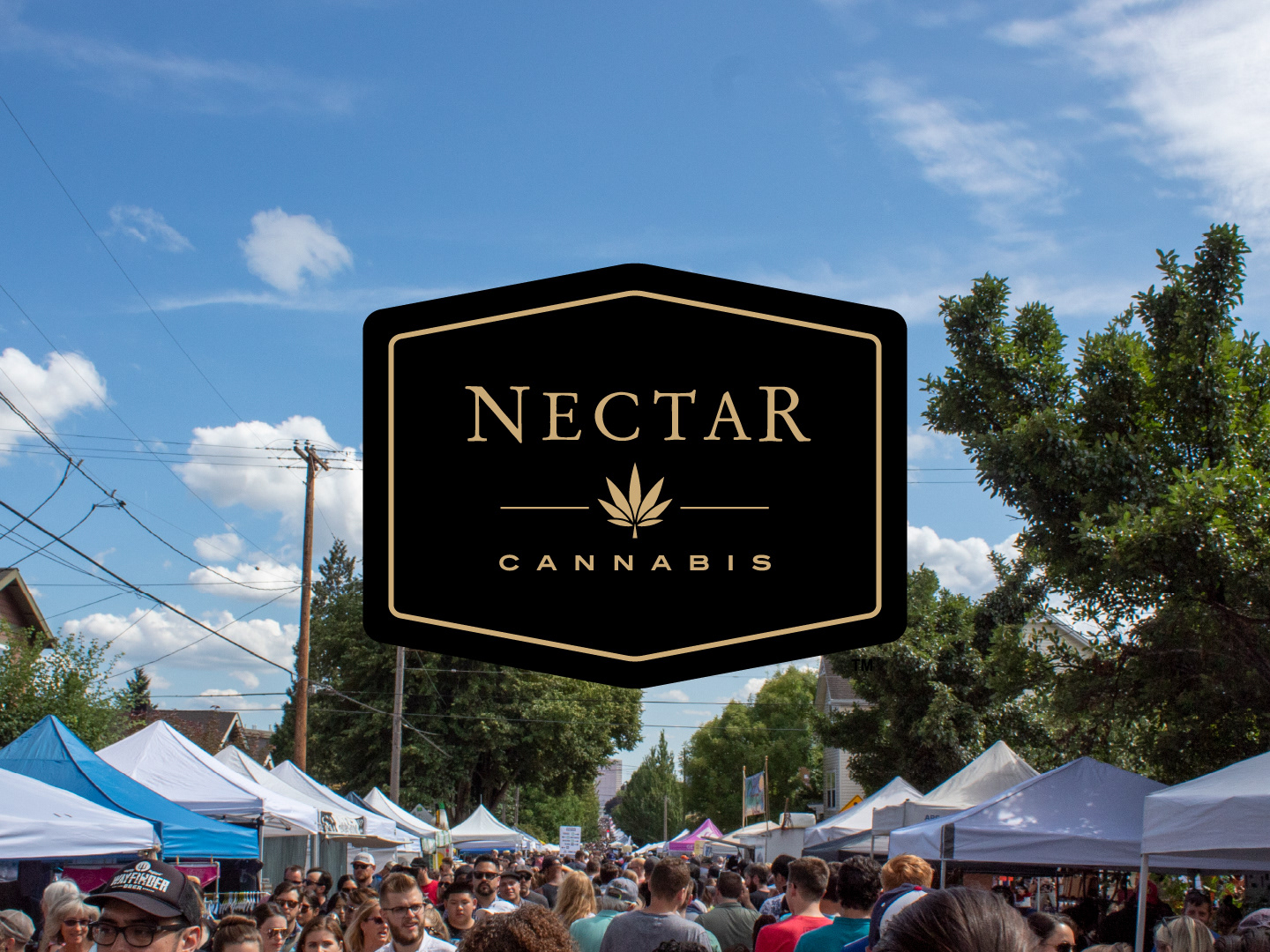
The badge was the beginning. The badge was a fan favorite mark within the company so ensuring its legibility on multiple mediums was an ideal course of action. The slim stroke to encase the badge shape only became necessary on black backgrounds.
Logomark
The leaf was intended to be the sole mark to identify the Nectar brand, and while it is in many ways, the leaf holds some unavoidable controversy within the industry as negative connotations surrounding cannabis continue to fade.
It was the intent for the leaf to be more identical to a yucca leaf to counter such controversies.
It was the intent for the leaf to be more identical to a yucca leaf to counter such controversies.
Logotype
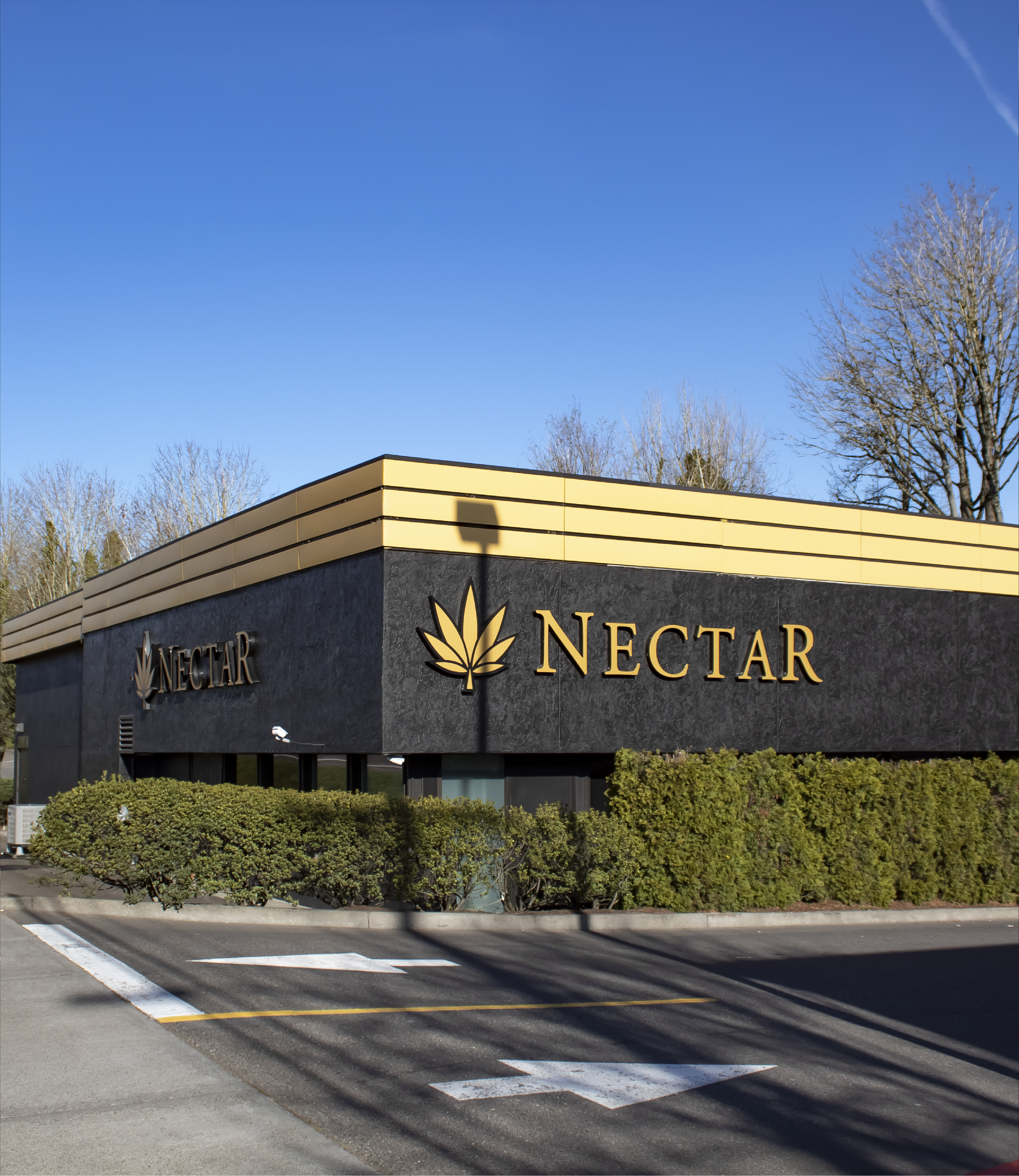
An alternative to the logotype and mark horizontal lockup, the Logotype is a smaller horizontal form factor where the addition of the Leaf might be excessive.
The mark makes use of a modified Garamond with varying letter sizes. I was tasked with cleaning up anchor points and jagged linework.
Logotype & Logomark
The logotype and Logomark combination make use of horizontal spaces where a badge wouldn’t fit, or a leaf would be too minimal.
Color
Nectar began with the Black and Gold as their brand colors, but they lacked flexibility. CMYK and RGB values, HEX and Pantone identities and color variations helped formalize a complete package.
Type
The Nectar brand was using a typeface that was ripped from the previous designer's personal collection, that was corrupted. Since we really needed a legible and stable typeface with a large font family for flexibility, Proxima Nova fit the bill quite nicely.
Proxima Nova Bold and Regular variations allowed for clean and concise displays of hierarchy.


