Thought Process
One of the many projects tasked to me while working with Nectar Markets, was to take advantage of the limited competition among cannabis pre-roll packs.
Cannabis pre-rolls are one of the most popular methods of consumption, but the cannabis pre-roll packs available at the time were too pricey for the average customer.
Nectar wanted a simple design: we utilized some notable Oregon colors alongside an ambiguous silhouette of flowering cannabis to draw attention to the logomark front and center.
Nectar wanted a simple design: we utilized some notable Oregon colors alongside an ambiguous silhouette of flowering cannabis to draw attention to the logomark front and center.
When I pitched this packaging design I encouraged forward thinking by considering what could be a product family in the future.
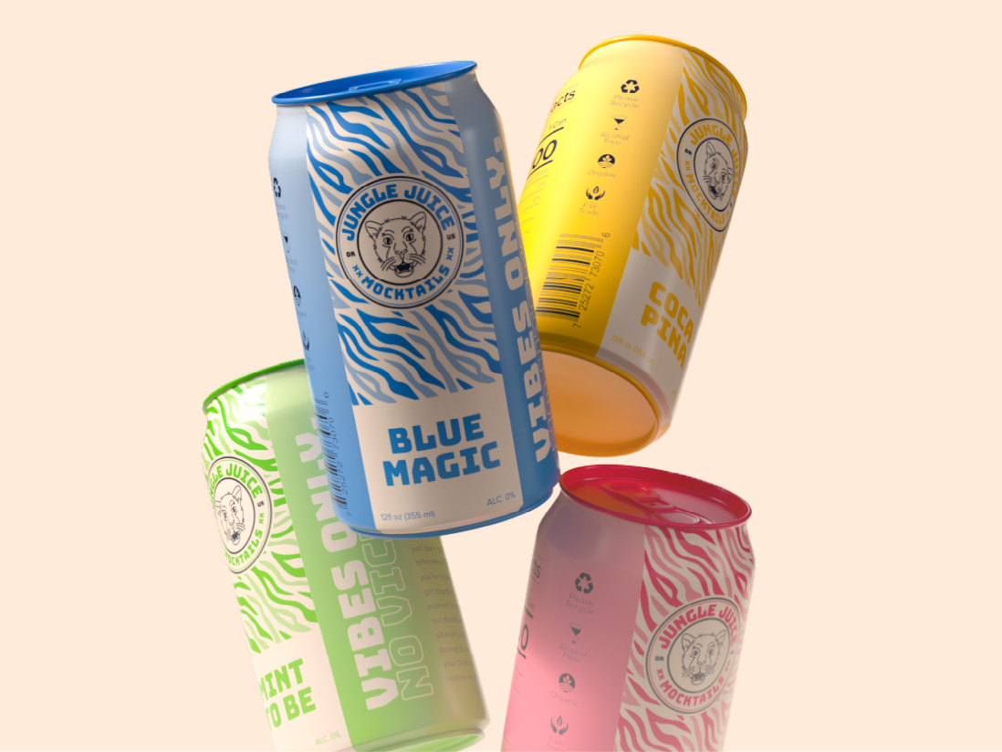
The goal is always to maintain consistency within a family, and the easiest way to do that for this project is a simple recolor: Reds and oranges identified with uplifting effects, while purples and blues identified with relaxing effects.
The goal is always to maintain consistency within a family, and the easiest way to do that for this project is a simple recolor: Reds and oranges identified with uplifting effects, while purples and blues identified with relaxing effects.
The inclusion of these two additional products would round out the family giving a more fulfilling selection.


